Hi. I’m a California-based designer helping organizations across culture, art, and technology translate their vision into meaningful brands and products.
Selected Work
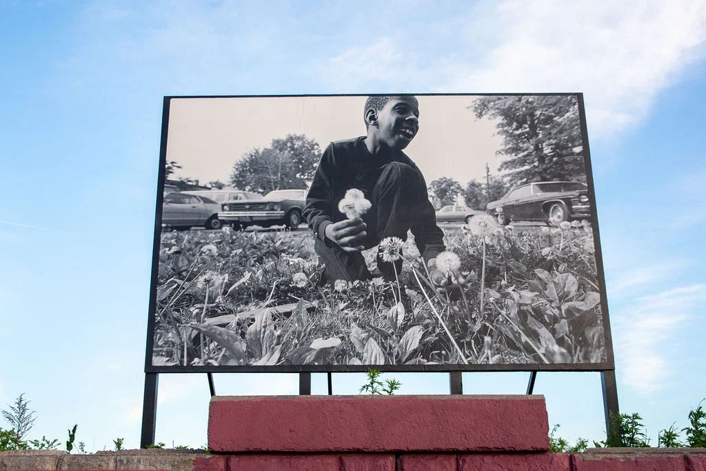
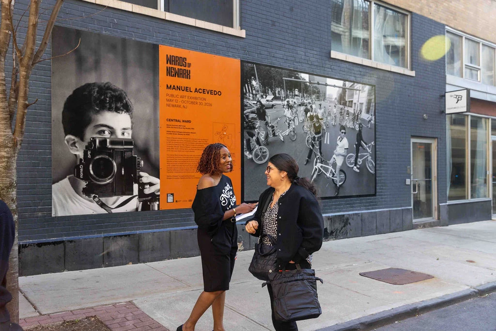
Wards of NewarkIdentity / Branding / Visual System2026
Credits
Creative Direction:
Salamishah Tillet and Connie Harvey
Curation:
Salamishah Tillet and Manuel Acevedo
Art Direction and Graphic Design:
Connie Harvey
Photos:
Steve Weinik, Vanessa Blake, and Malaika Muindi
Typefaces:
Spike by Vocal Type and TT Commons Pro
by Adobe
Press
Client
Salamishah Tillet and Manuel Acevedo
for the Emerson Collective
Context
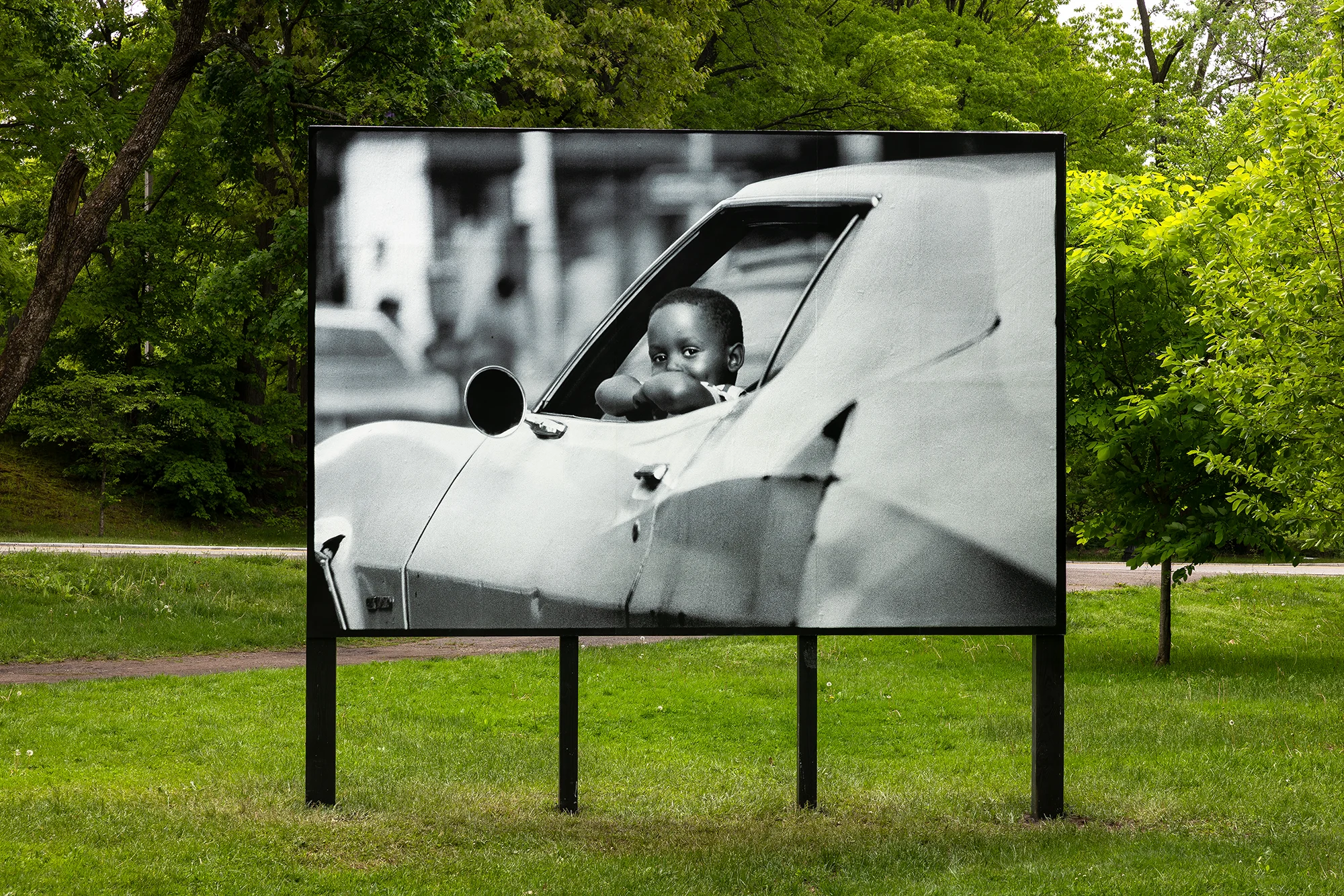
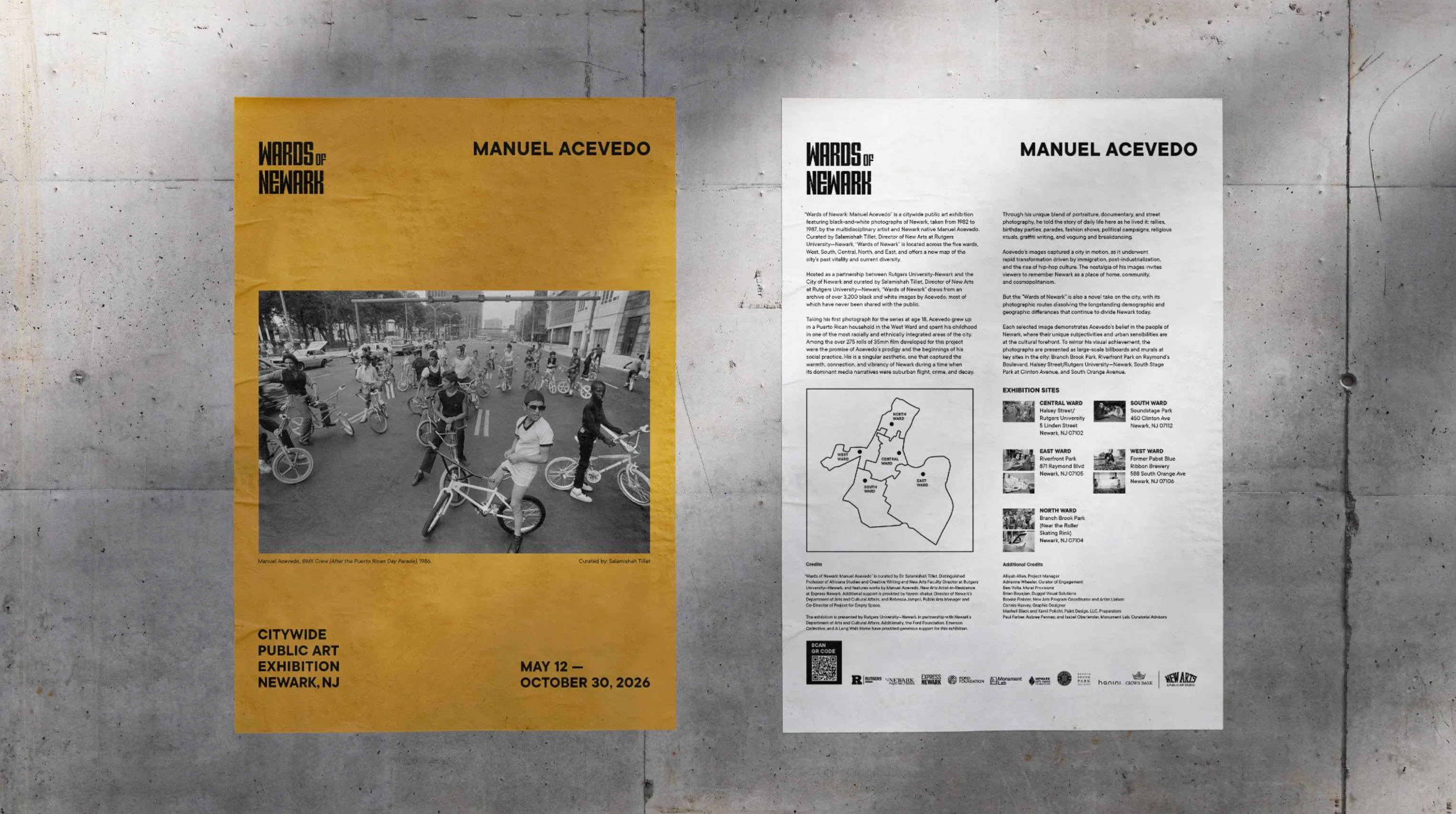
Wards of Newark: Manuel Acevedo is a citywide public art exhibition featuring black-and-white photographs of Newark, NJ, taken from 1982 to 1987, by the multidisciplinary artist and Newark native Manuel Acevedo. Curated by Salamishah Tillet, Director of New Arts at Rutgers University—Newark, “Wards of Newark” is located across the five wards, West, South, Central, North, and East, and offers a new map of the city’s past vitality and current diversity.
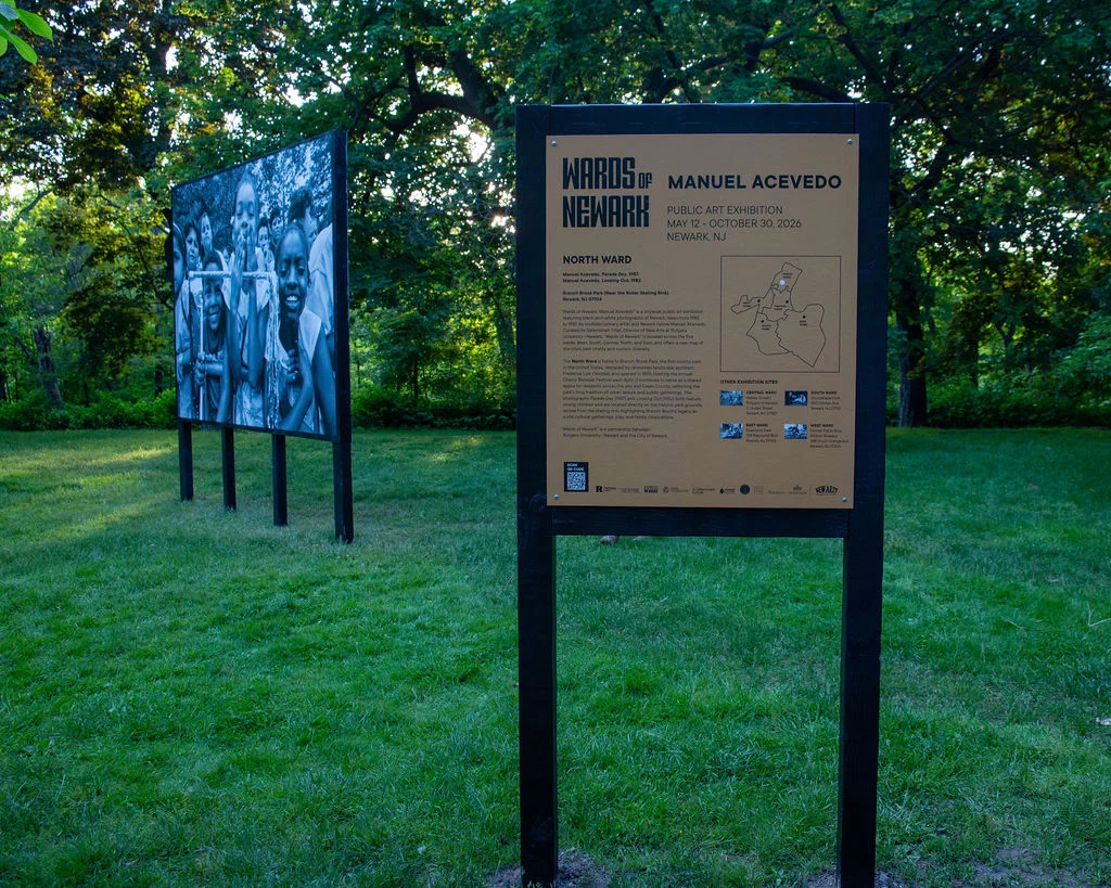
Hosted as a partnership between Rutgers University—Newark and the City of Newark, “Wards of Newark” features large-scale billboards and murals at five key sites in the city.
The Ask
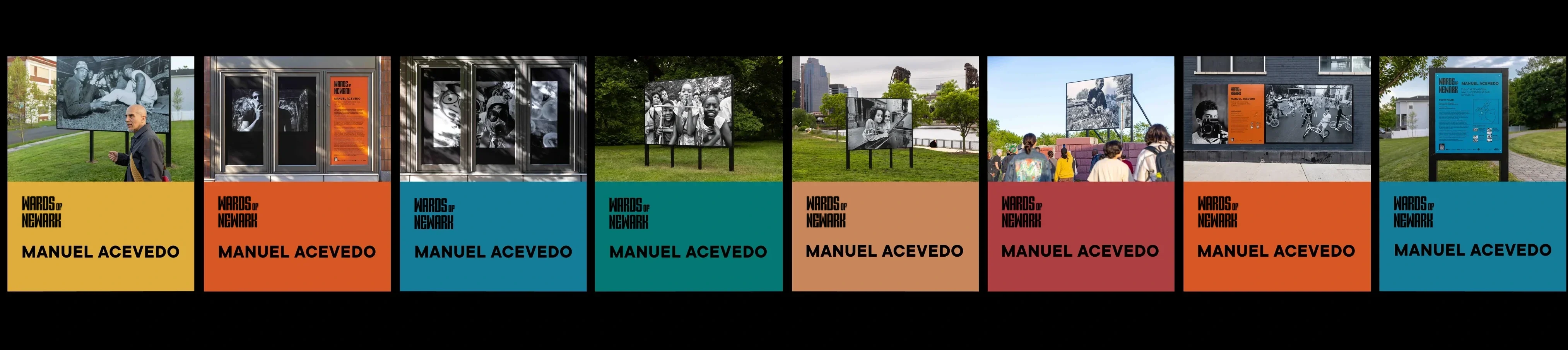
Our objective was to create and execute a variety of communication materials that will raise public awareness, enhance engagement, and provide a sense of curiosity as well as education at the site of Wards of Newark: Manuel Acevedo. The assets included a visual identity, exhibition signage and experiential graphics, digital and physical maps of installation in Newark, social media assets, and website design and development.
Express NewarkIdentity / Branding / Spatial Design / Web Design2025
Credits
Creative Direction:
Salamishah Tillet, Nick Kline, and Connie Harvey
Art Direction and Graphic Design:
Connie Harvey
Curation:
Salamishah Tillet and Alliyah Allen
Photos:
Anthony Alvarez, Rachel Vanni, and Irina Mason
Typefaces:
VTC Martin by Vocal Type, ABC Social by Dinamo Typefaces, and Gotham by Hoefler&Co
Press
Client
Salamishah Tillet, Nick Kline, and Alliyah Allen for Rutgers University—Newark
Context
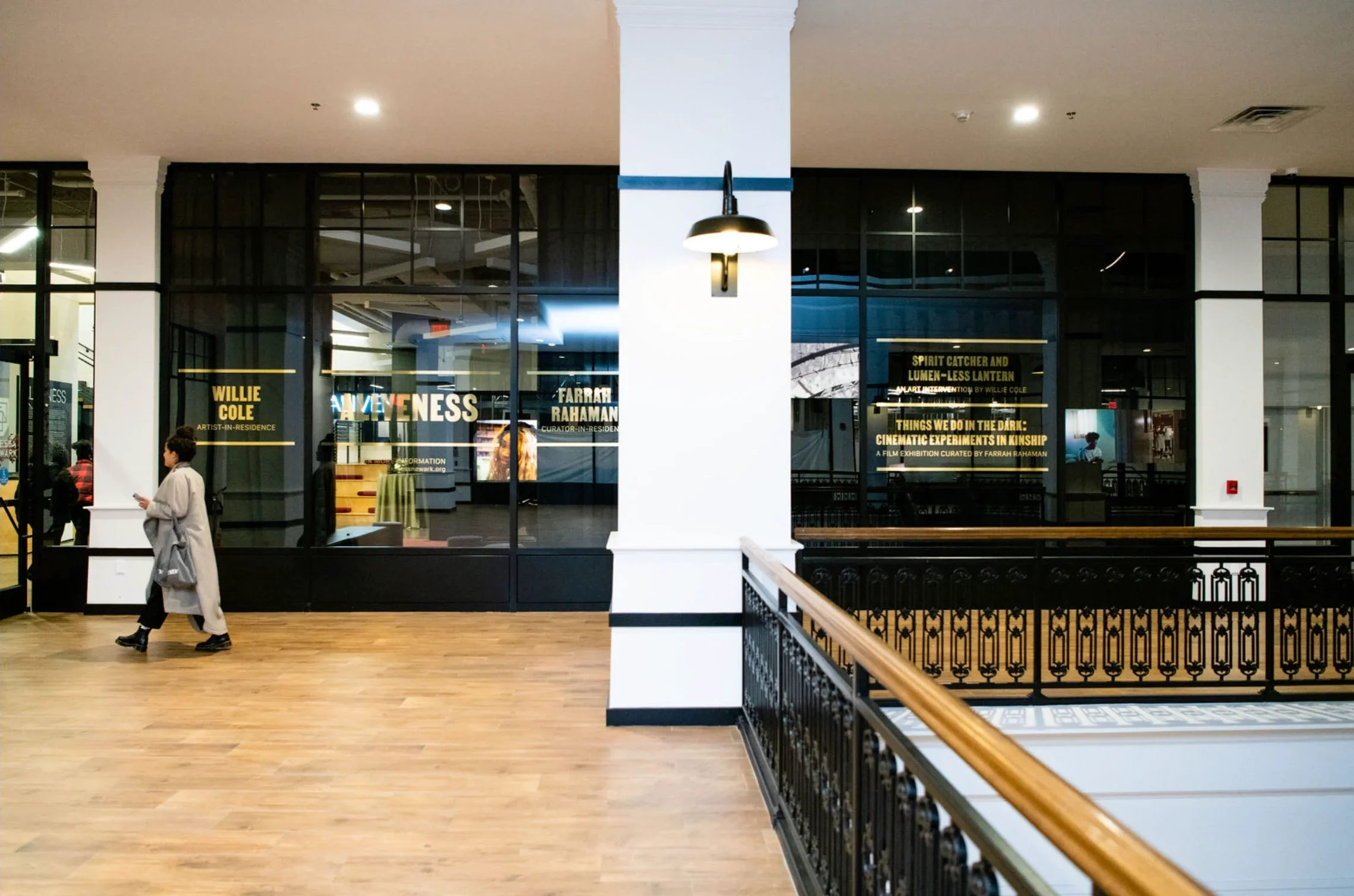
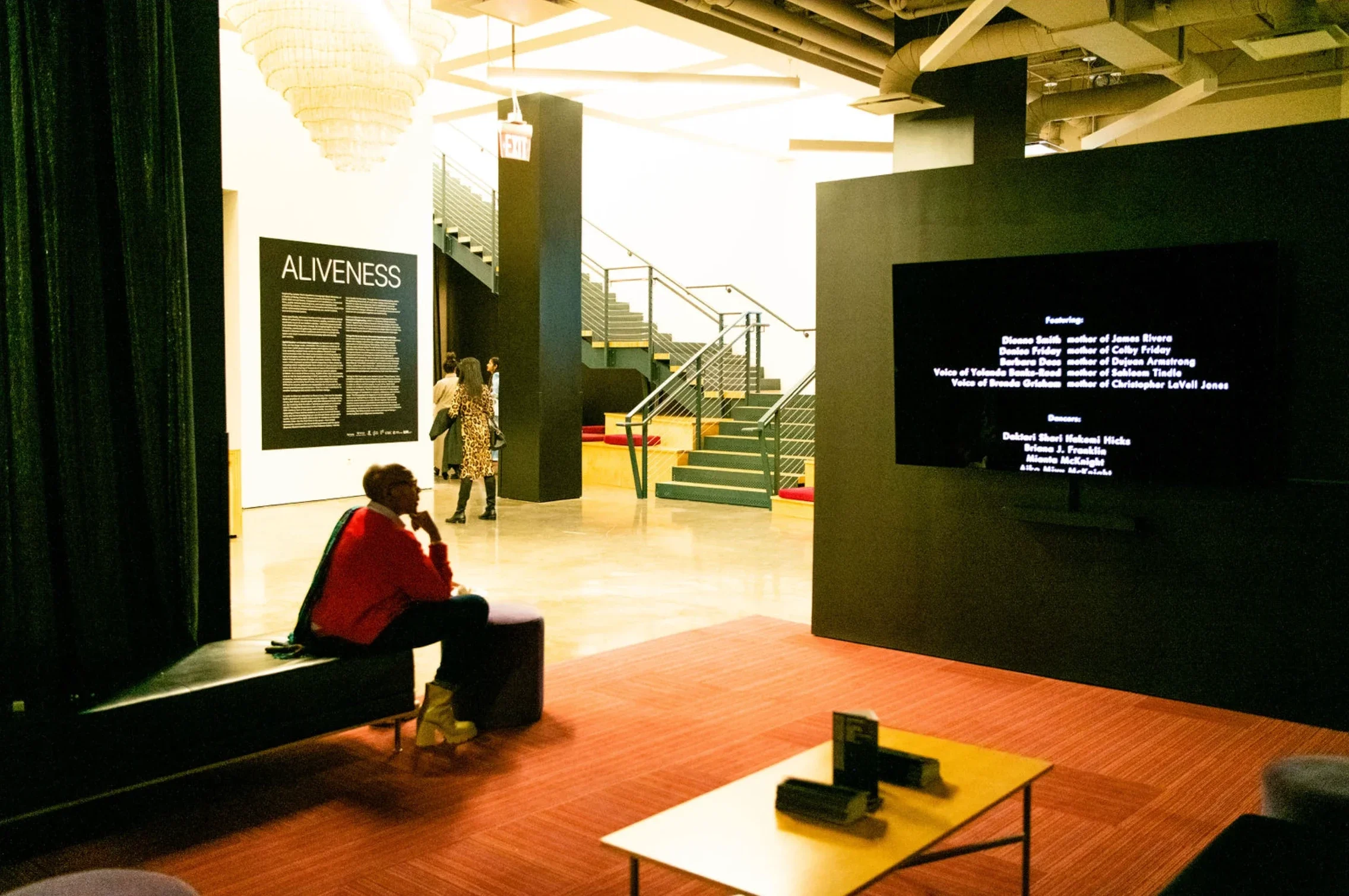
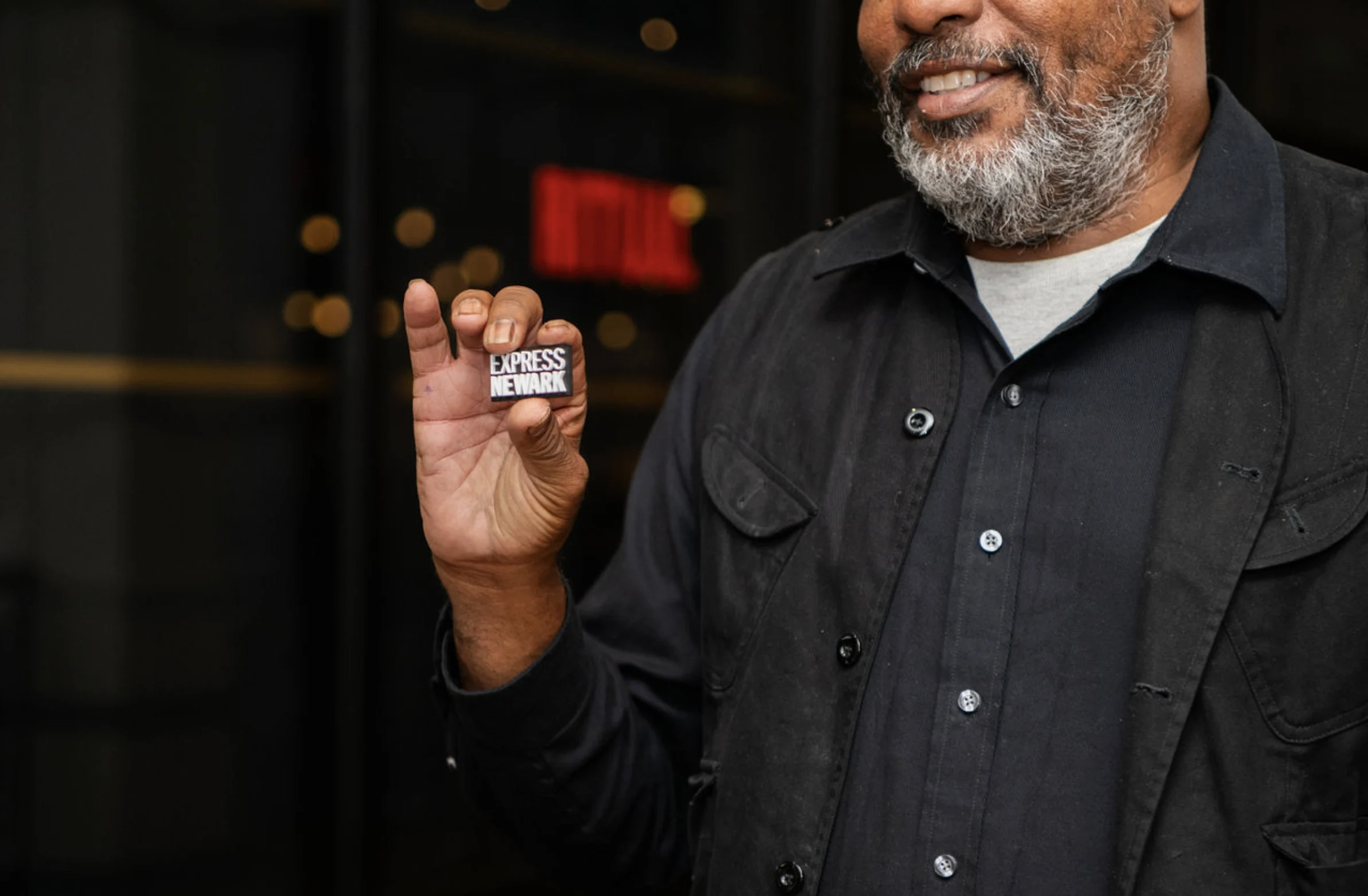
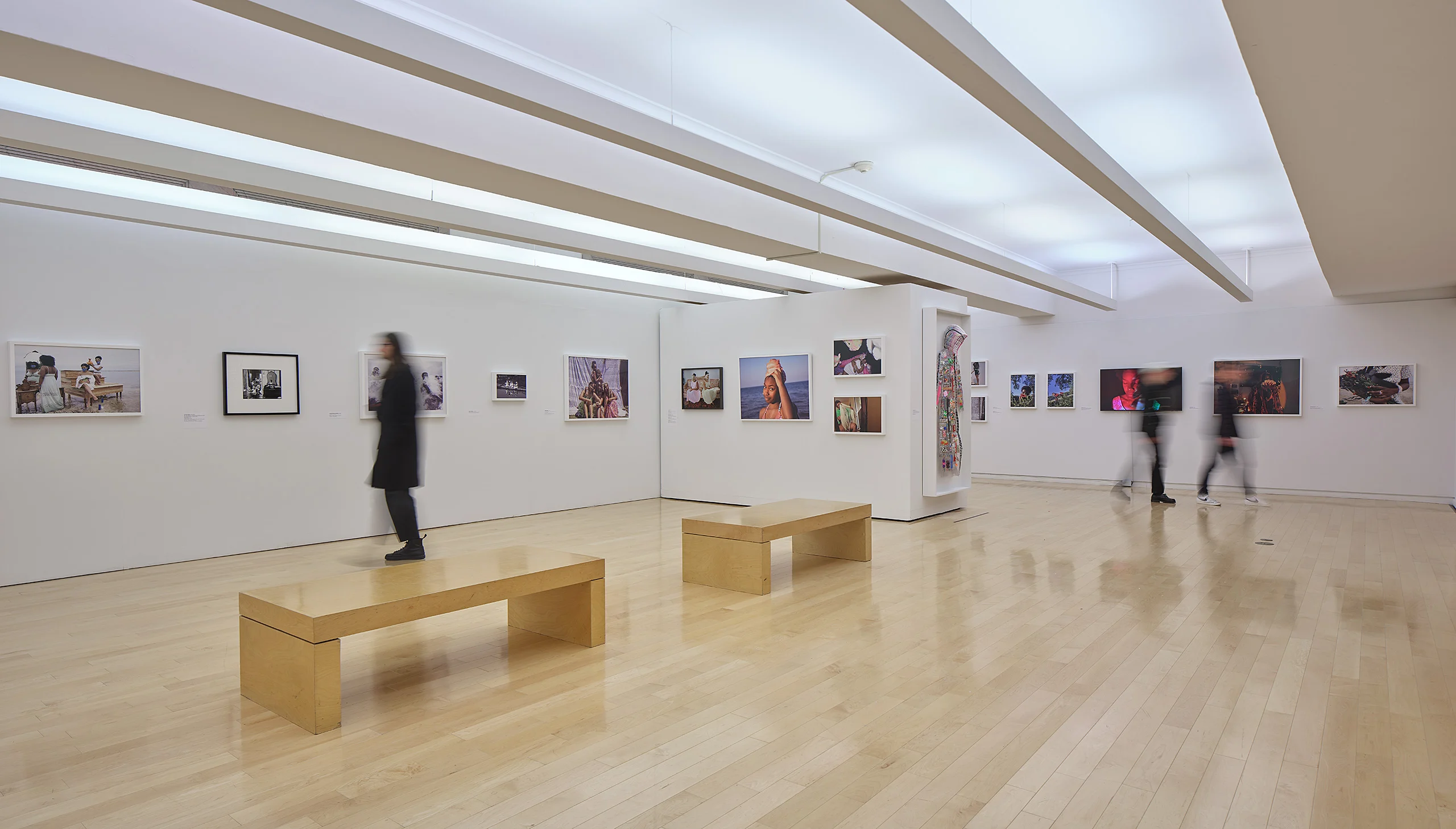
Express Newark is a 50,000 square foot center in Newark, NJ (formerly Hahne & Co. department store and now part of Rutgers University—Newark) for socially engaged art and design. Community members have access to three floors of numerous art galleries, meeting spaces, learning labs, and maker spaces.
The Ask
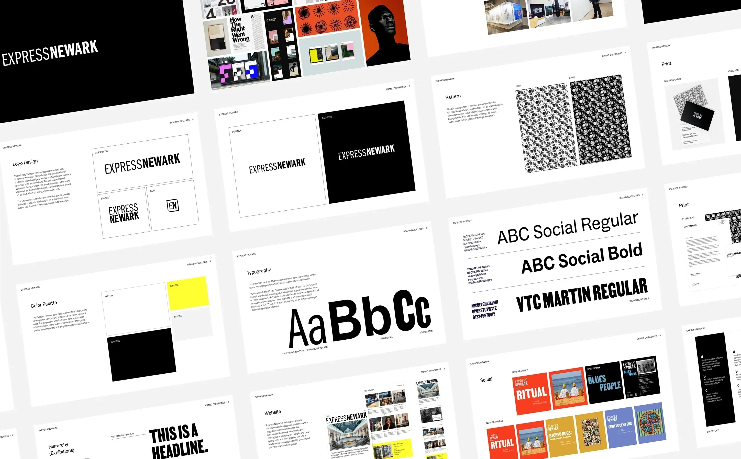
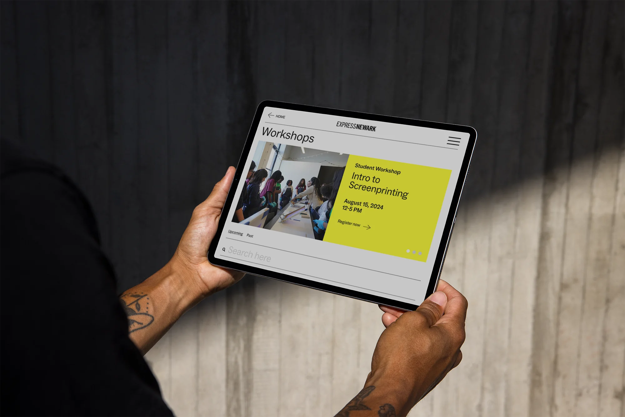
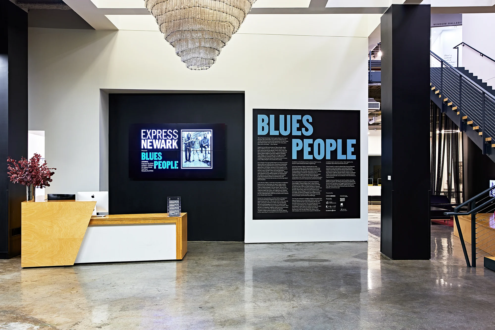
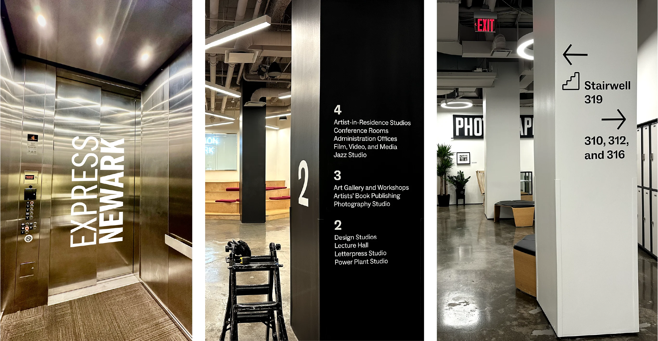
This project entailed holistic brand for on-site and digital engagement. The design brief requested that we pay homage to Newark’s past as a vanguard for art and activism, while allowing the art and the space to become the hero. Deliverables included a new visual identity, onsite wayfinding, digital and print collateral, social media campaigns.
What resulted was an identity system that is now in conversation with the artists, faculty, staff, students, and featured art exhibitions, while firmly grounding itself as a destination within the University and surrounding community.
A Long Walk HomeIdentity / Branding / Web Design2024
Credits
Creative Direction:
Scheherazade Tillet and Connie Harvey
Art Direction and Graphic Design:
Connie Harvey
Photos:
Scheherazade Tillet, Kyle Flubacker, Oriana Koren, Tom Harris, and Cory Dewald
Public Relations:
Florie Hutchinson
Typeface:
ABC Arizona by Dinamo Typefaces
Press
Clients
Scheherazade Tillet and Salamishah Tillet
for A Long Walk Home
Context
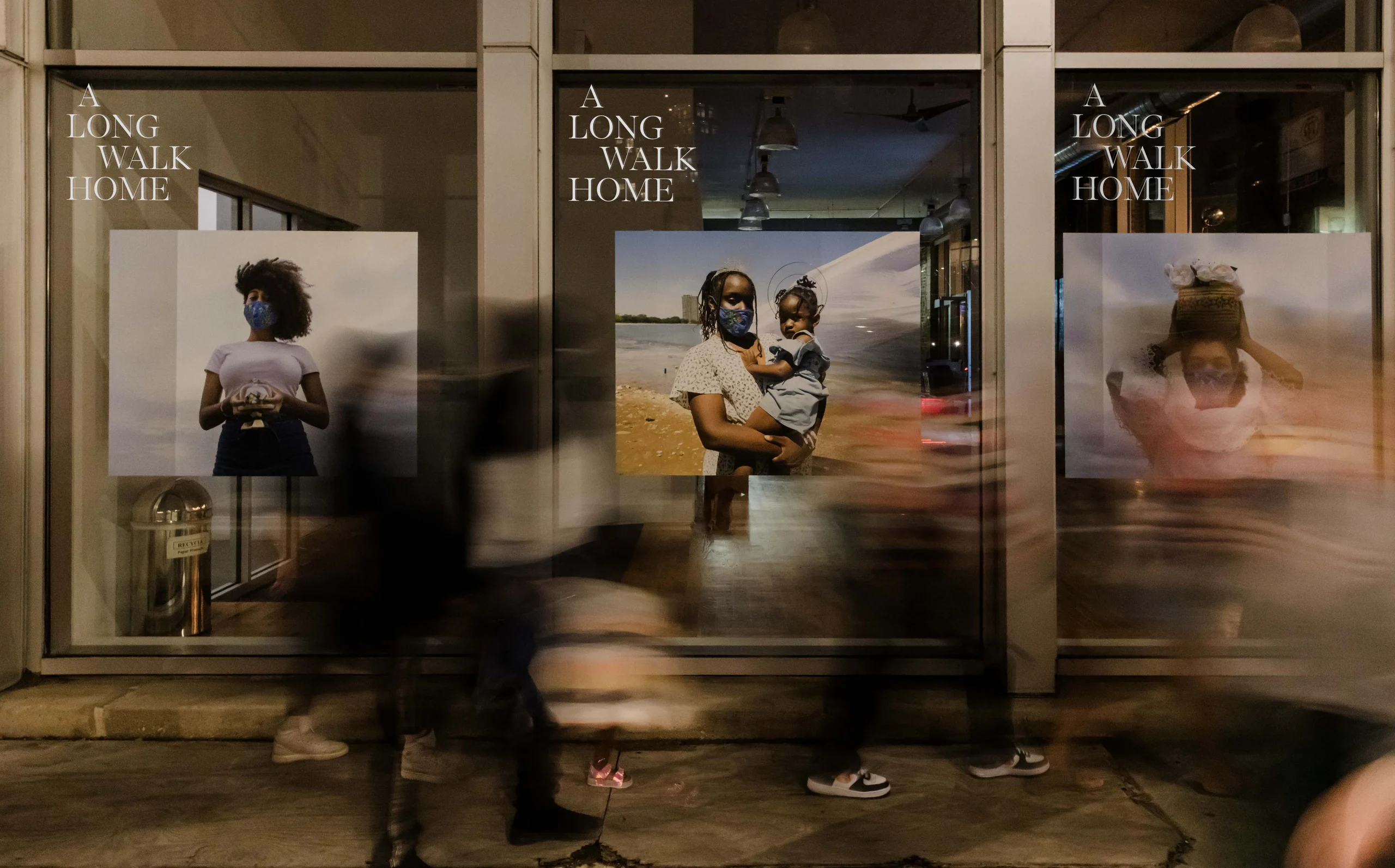
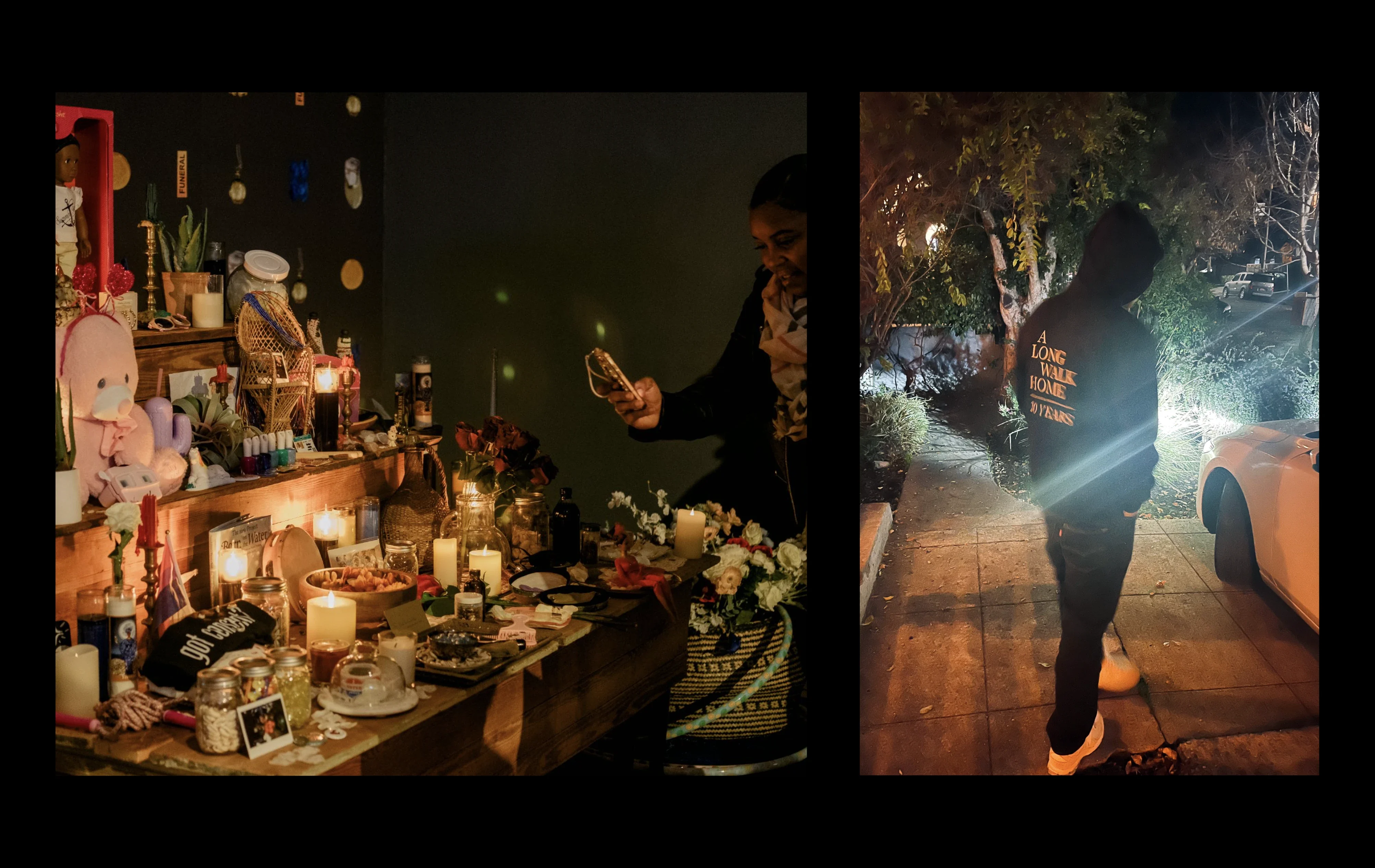
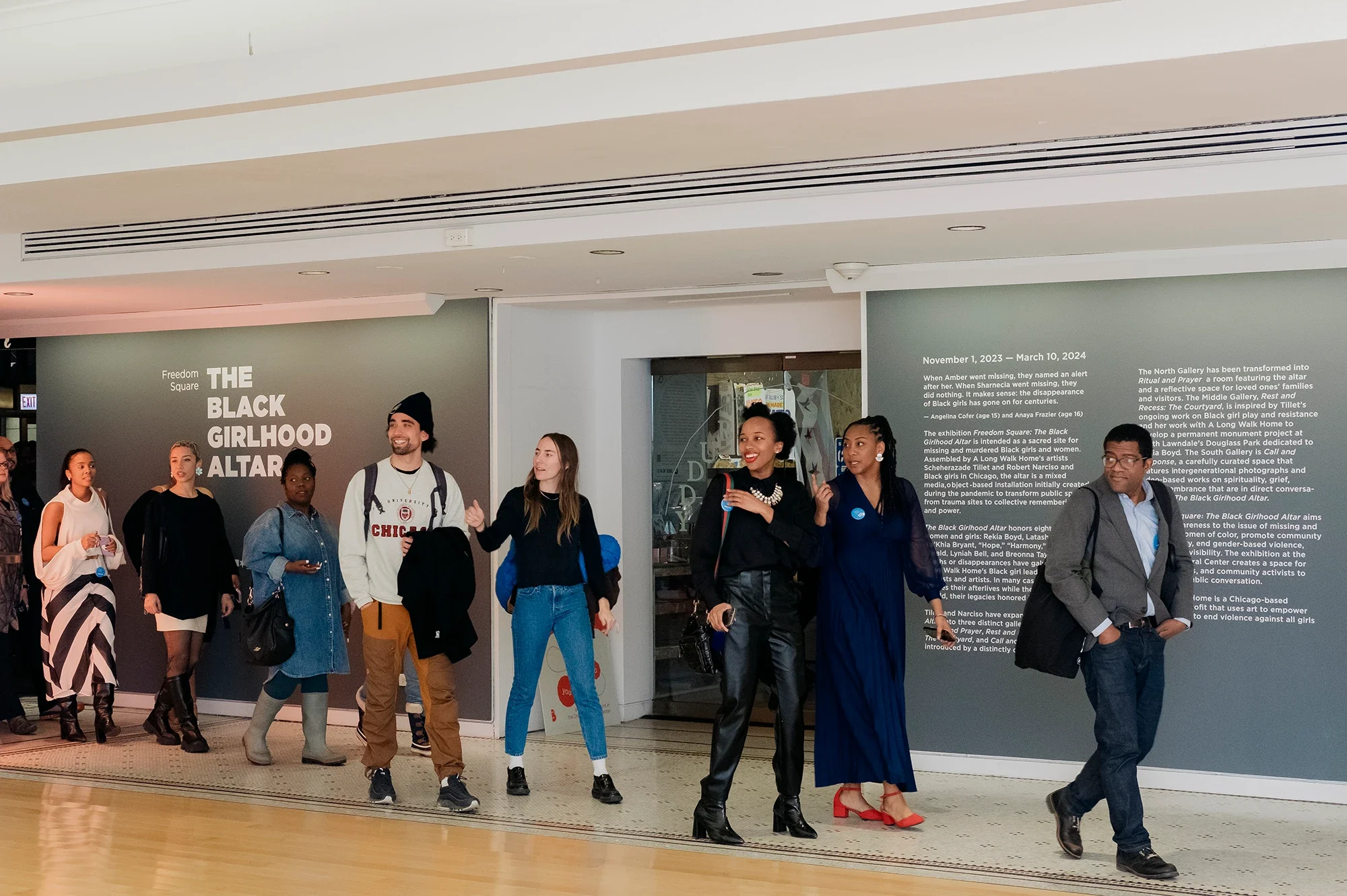
A Long Walk Home is a national organization based in Chicago that uses art to empower young people and end violence against women and girls. It’s one of the foremost organizations that empowers girls and young women to use their voices and artistic visions to organize themselves, their communities, and our country to be free of gender-based and racial violence.
The Ask
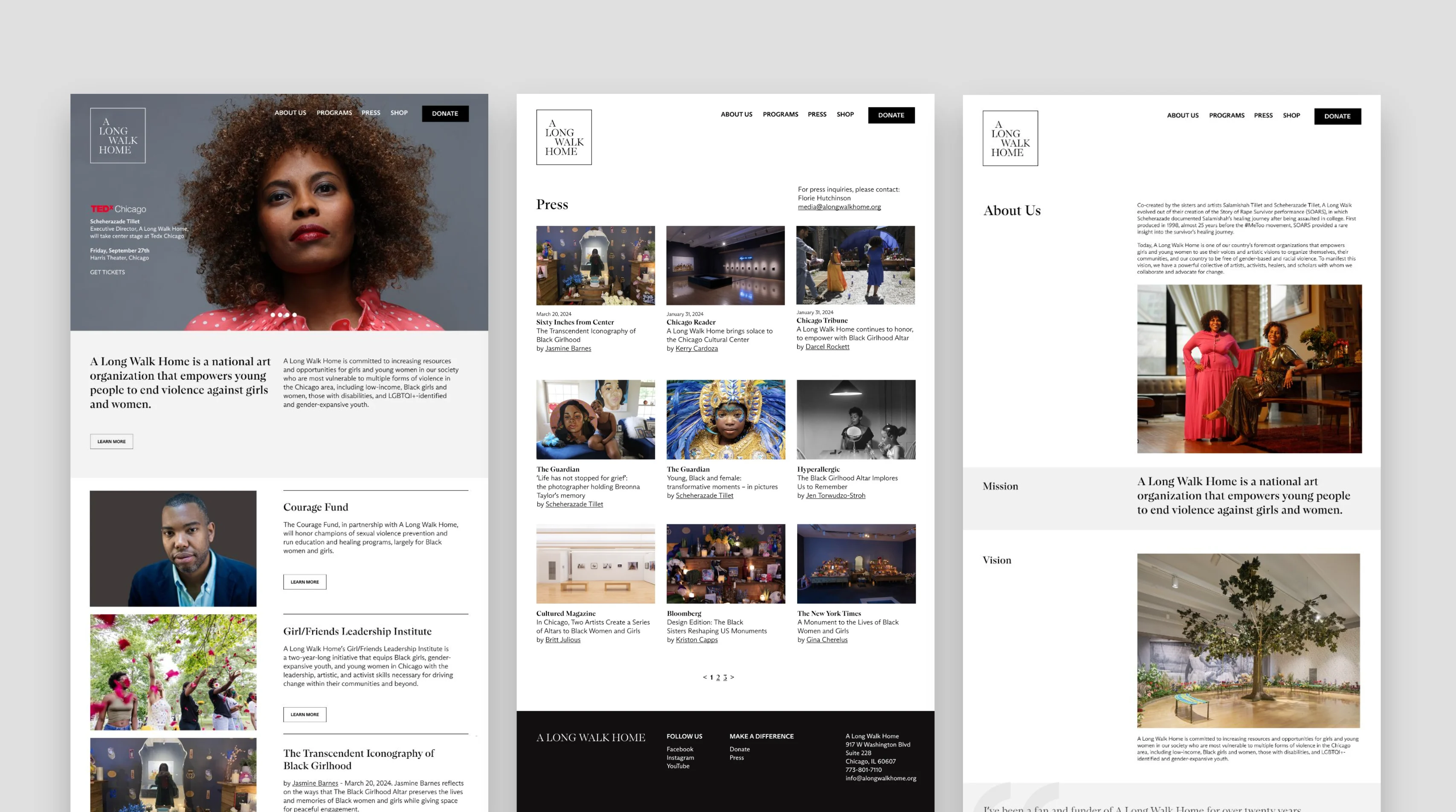
Develop a brand refresh to build a trustworthy and elevated presence locally and on a national scale. The new identity should also read as an established arts organization.
We rolled out this new identity system to coincide with the twenty-year anniversary of A Long Walk Home and the launch of the newly refreshed website.
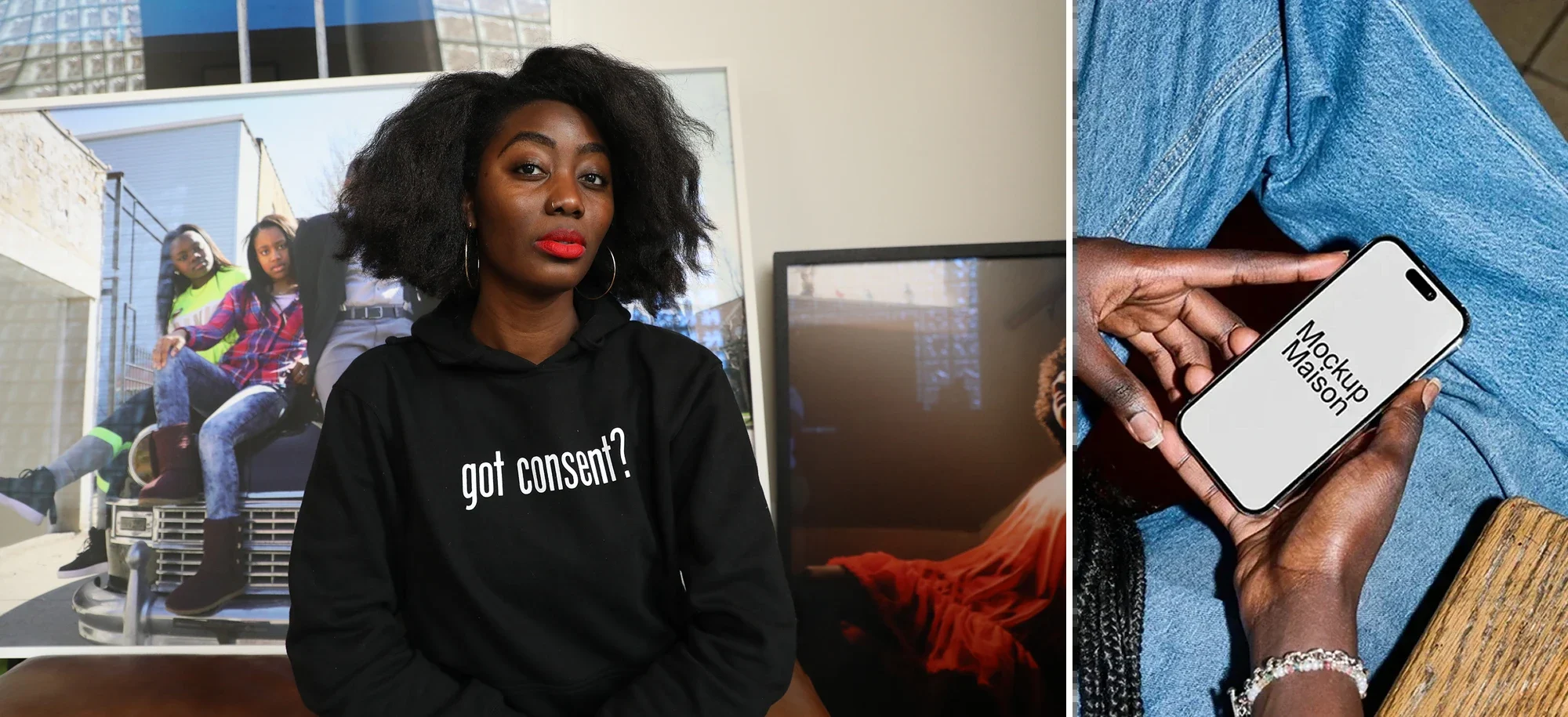
The result has been an increase in awareness of the organization, via audience views, SEO presence, more donations, and a design system that is now malleable to fit within a number of contexts.
Declaration HouseIdentity / Branding2024
Credits
Creative Direction:
Connie Harvey and Blair Richardson
Art Direction and Graphic Design:
Connie Harvey and Blair Richardson
Motion Design: Mirra Fine
Typeface:
Du Bois by Vocal Type
Press
Client
Context
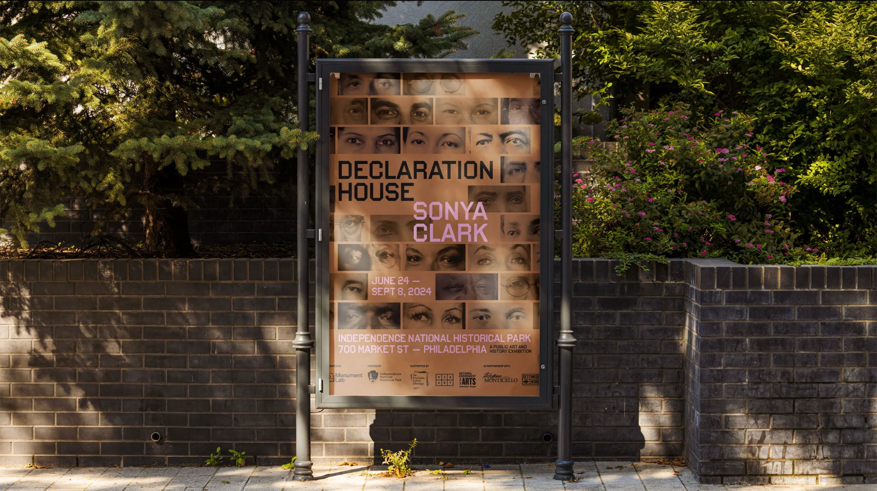
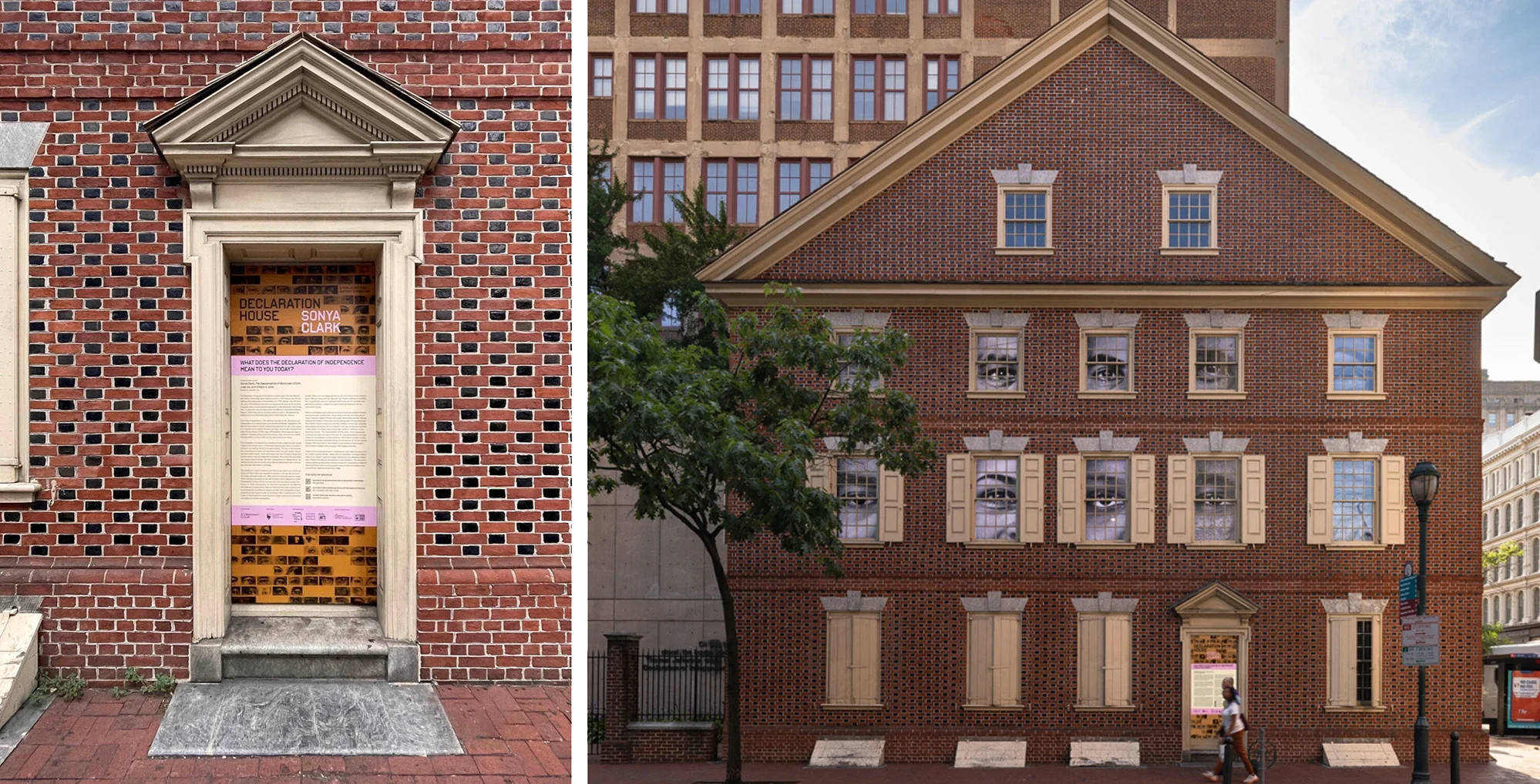
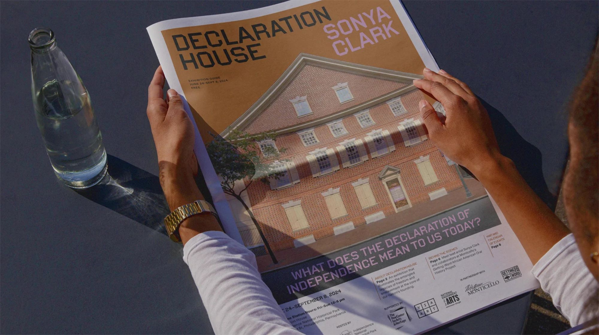
Declaration House is a public art and history exhibition, centered in the heart of downtown Philadelphia, that explores the site where Thomas Jefferson and Robert Hemmings resided several months while Jefferson drafted the Declaration of Independence in 1776. The project seeks to illuminate the entangled legacies of freedom and enslavement at the core of our nation’s founding.
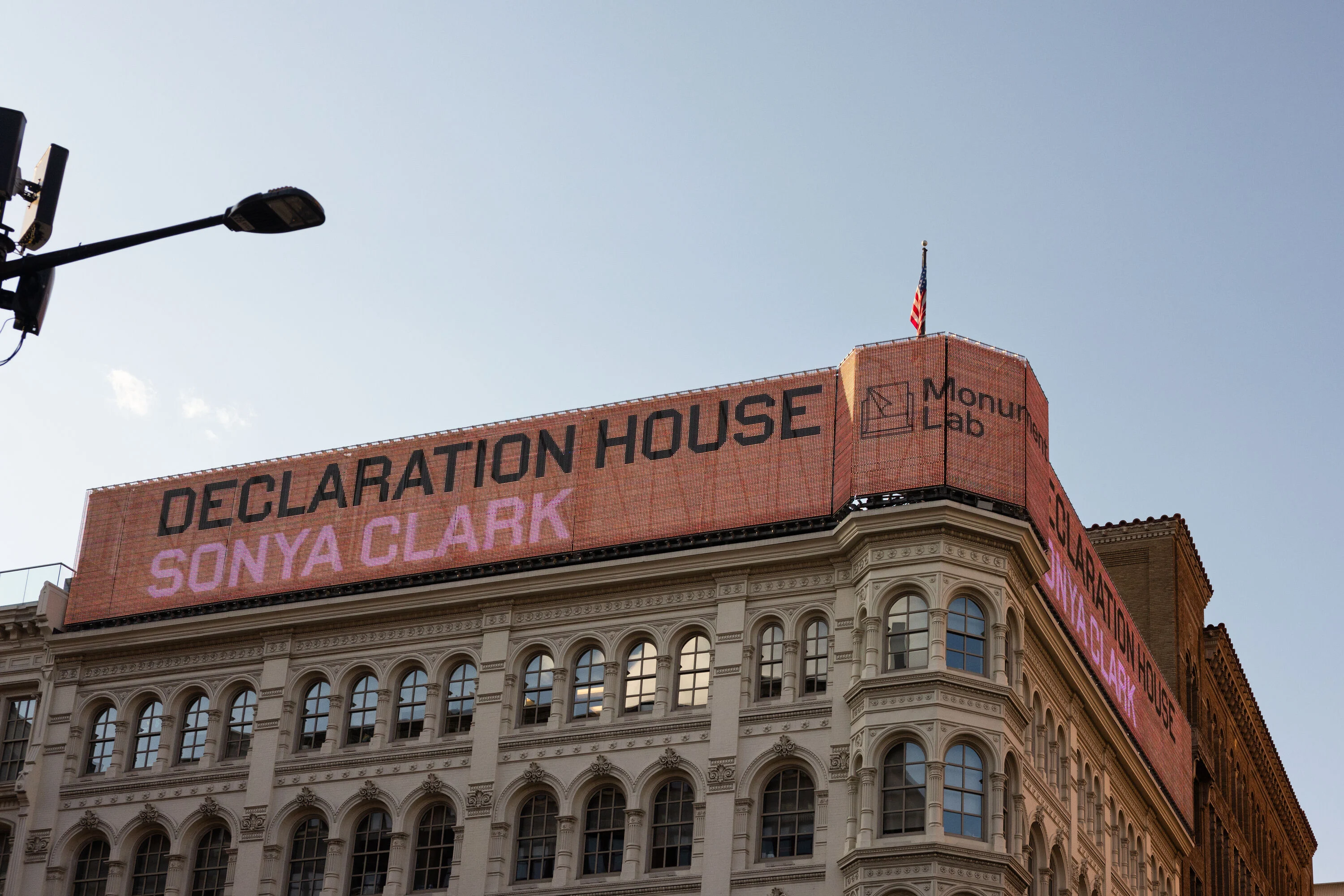
Declaration House’s premiere of Sonya Clark’s “The Descendants of Monticello,” featured a public artwork that brought the historic house to life.
The Ask
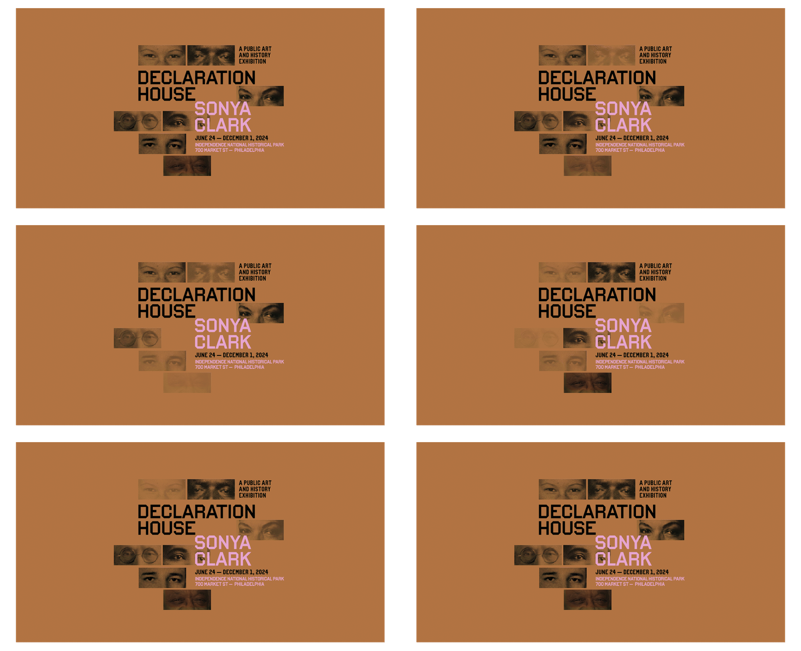
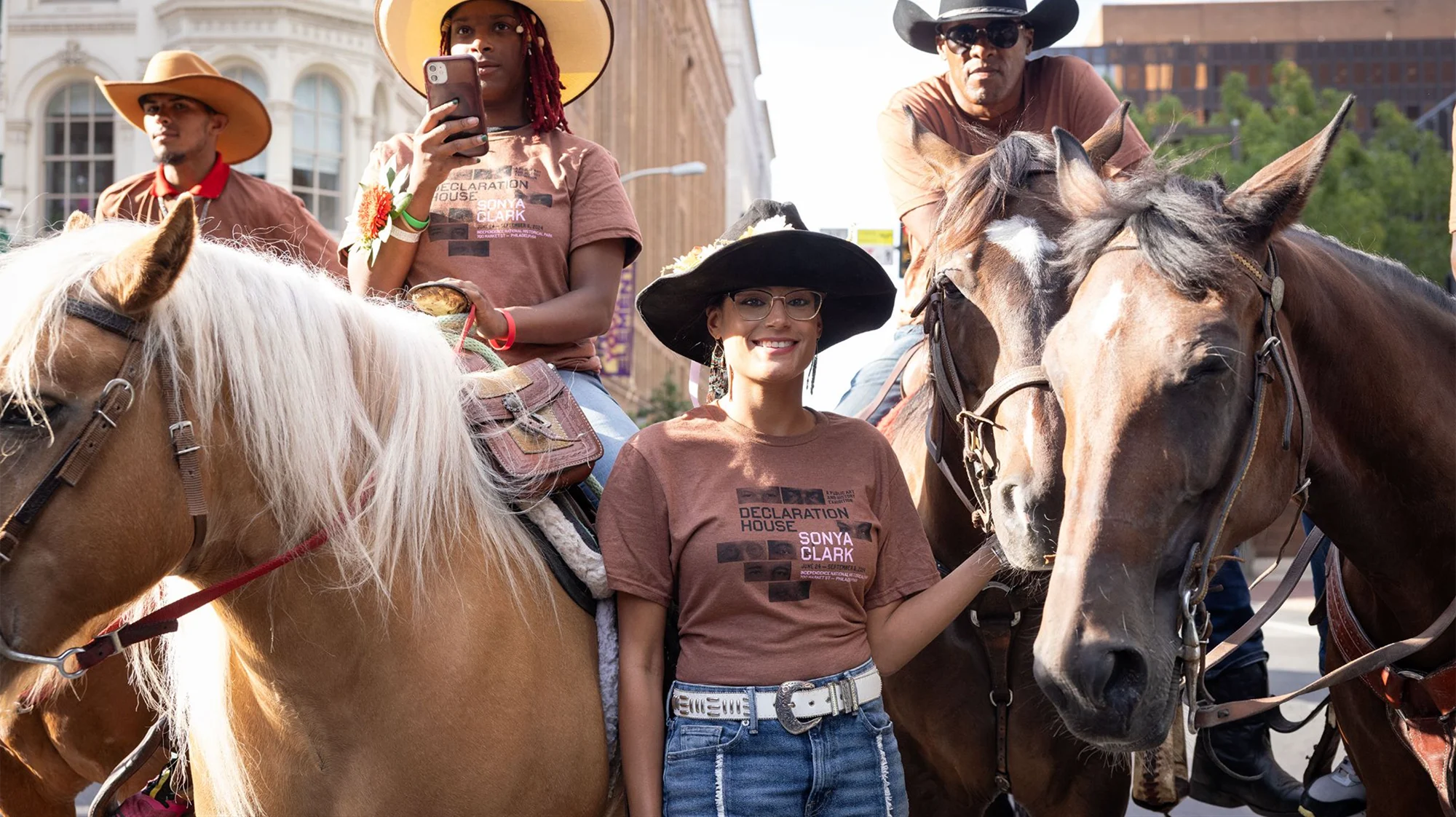
Create two visual identities that work together: One for Declaration House and one for the Sonya Clark installation. We built a branded design system that could be applied to wayfinding, social media, web, exhibition publications, posters, and digital materials.
Beyond Granite: Pulling TogetherIdentity / Branding / Spatial Design2023
Credits
Creative Direction:
Connie Harvey and Blair Richardson
Art Direction and Graphic Design:
Connie Harvey and Blair Richardson
Motion Design: Mirra Fine
Curation:
Monument Lab and Trust for the National Mall
Public Relations:
Florie Hutchinson
Typefaces:
VTC Colorful Bold by Vocal Type and TT Commons Pro by Adobe
Press
Client
Mellon Foundation
Monument Lab
The National Park Service
Trust for the National Mall
Context
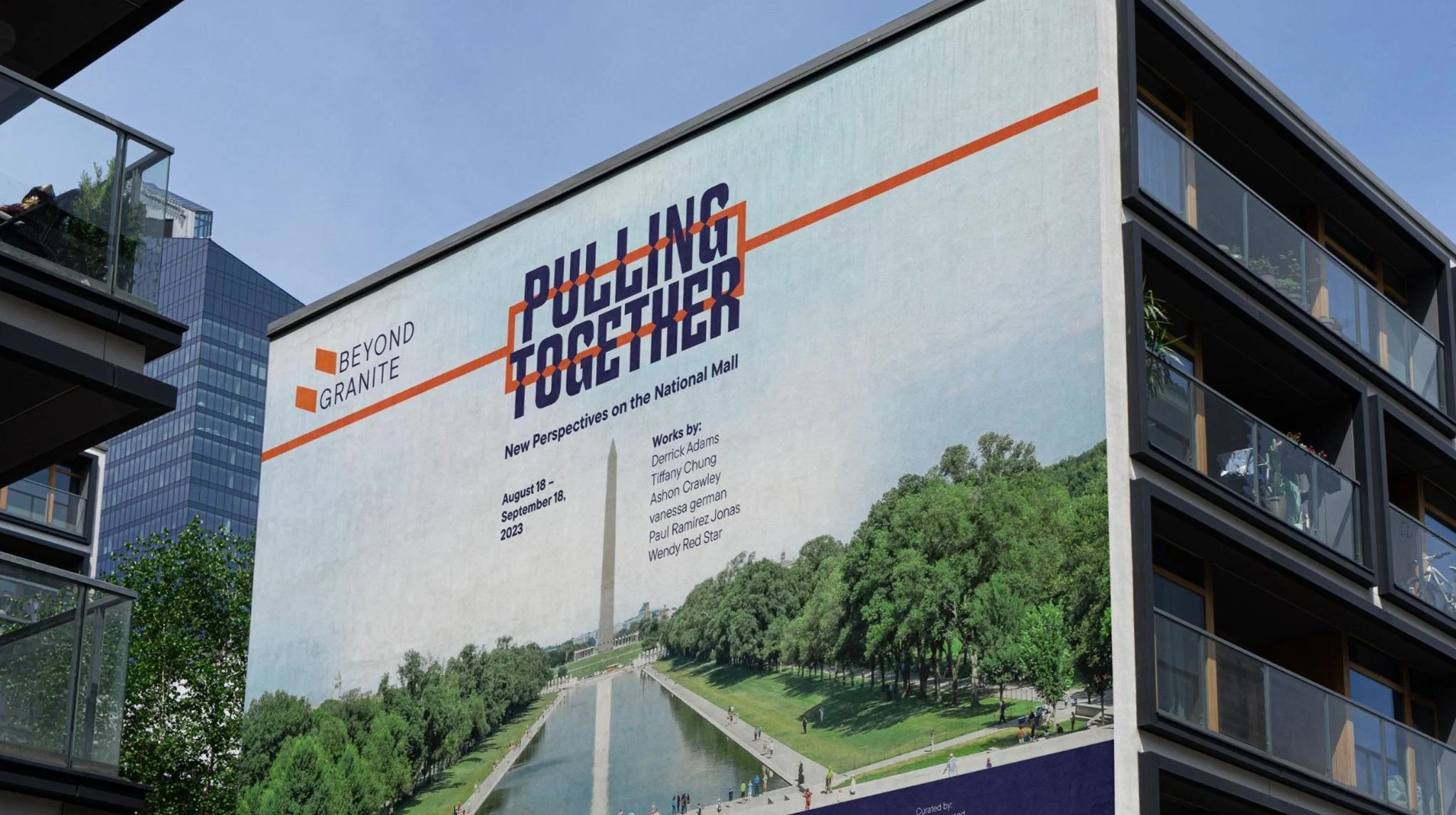
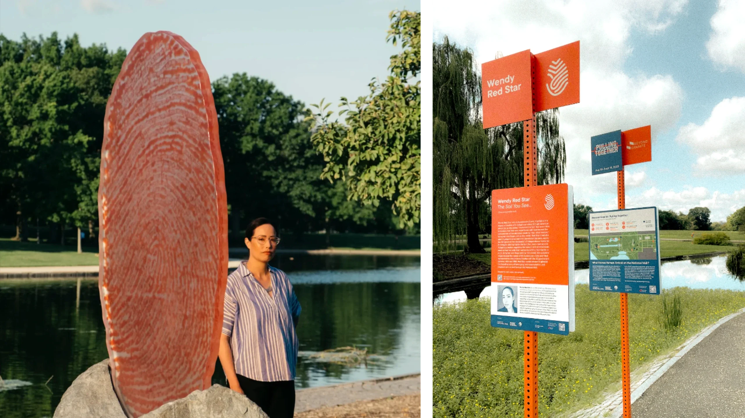
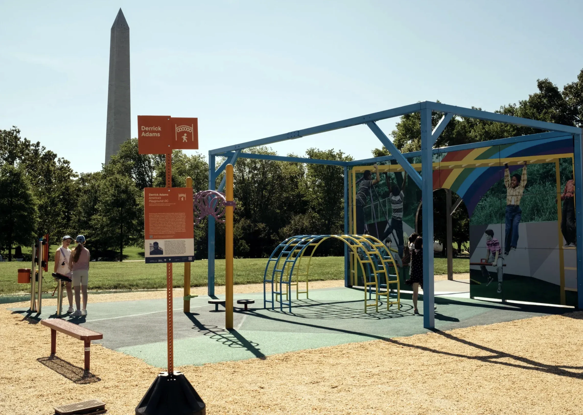
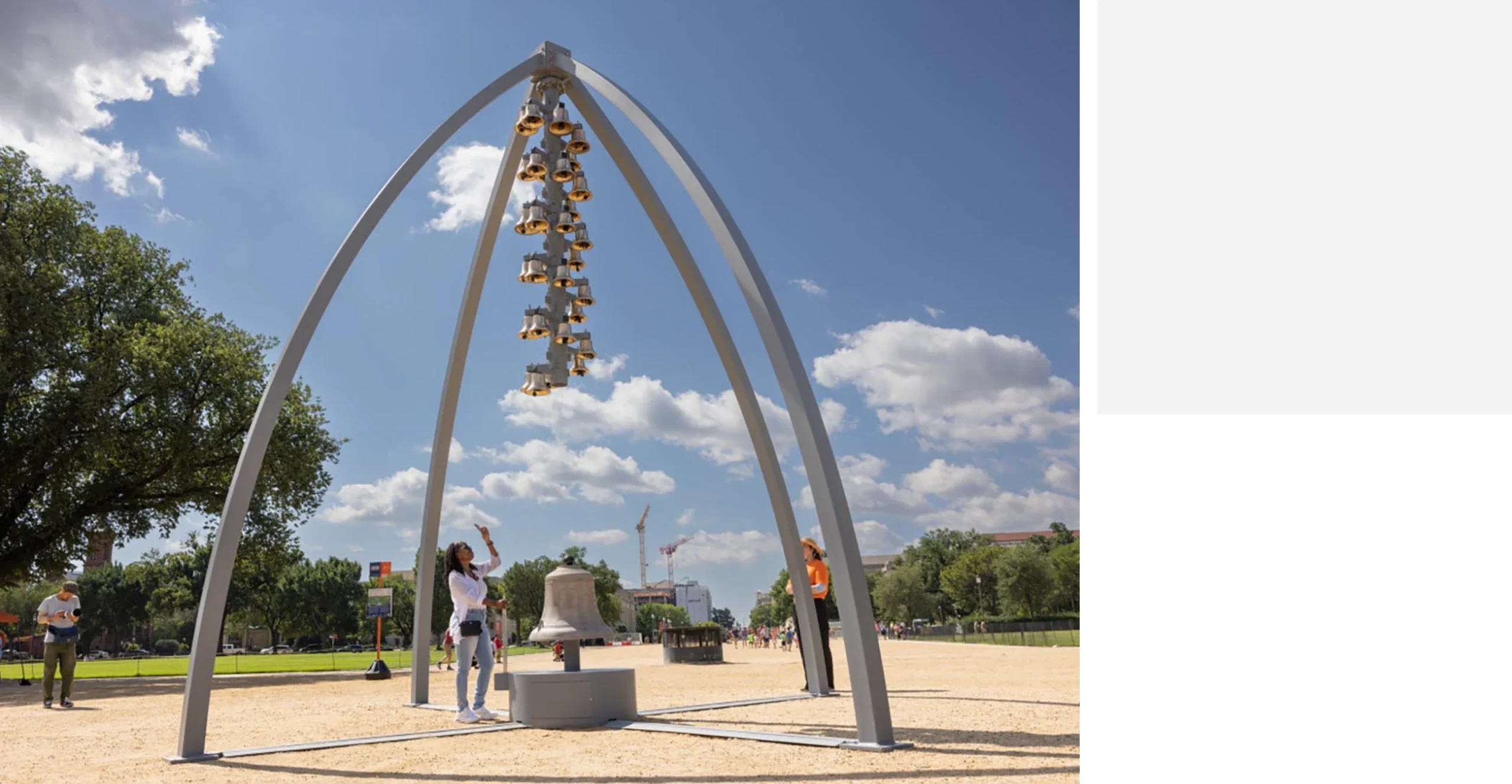
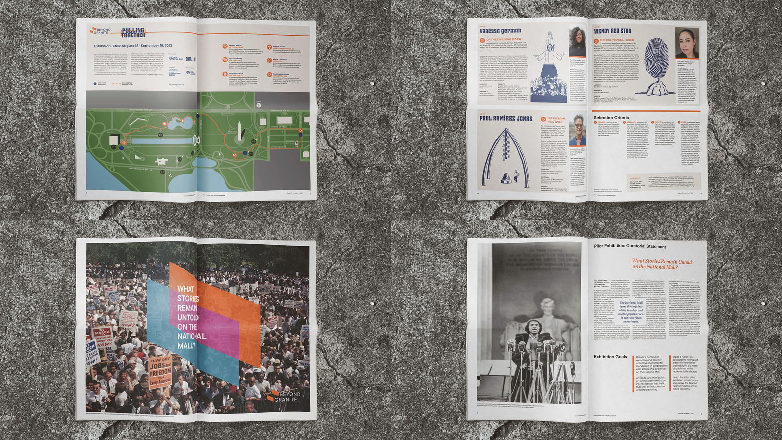
Beyond Granite: Pulling Together was the first curated outdoor exhibition in the history of the National Mall in Washington, DC. This month-long exhibition featured prototype monuments that respond to the central question “What stories remain untold on the National Mall?”
Beyond Granite: Pulling Together was inspired by the 1939 Easter Sunday performance of renowned Black opera singer, Marian Anderson, on the steps of the Lincoln Memorial, as she was barred from nearby Constitution Hall due to segregation in the capital. Her performance remains monumental in public memory with educator and civil rights activist Mary McLeod Bethune remarking at the time that the performance “told a story of hope for tomorrow—a story of triumph—a story of pulling together, a story of splendor and real democracy.”
The goal of the exhibition was to bring together innovative and experimental forms of monumentality and memory-making to shine a light on and acknowledge Indigenous legacies, histories of enslavement, civil rights, LGBTQ activism, pathways for immigration, environmental justice, and other narratives of American struggle and survival.
The Ask
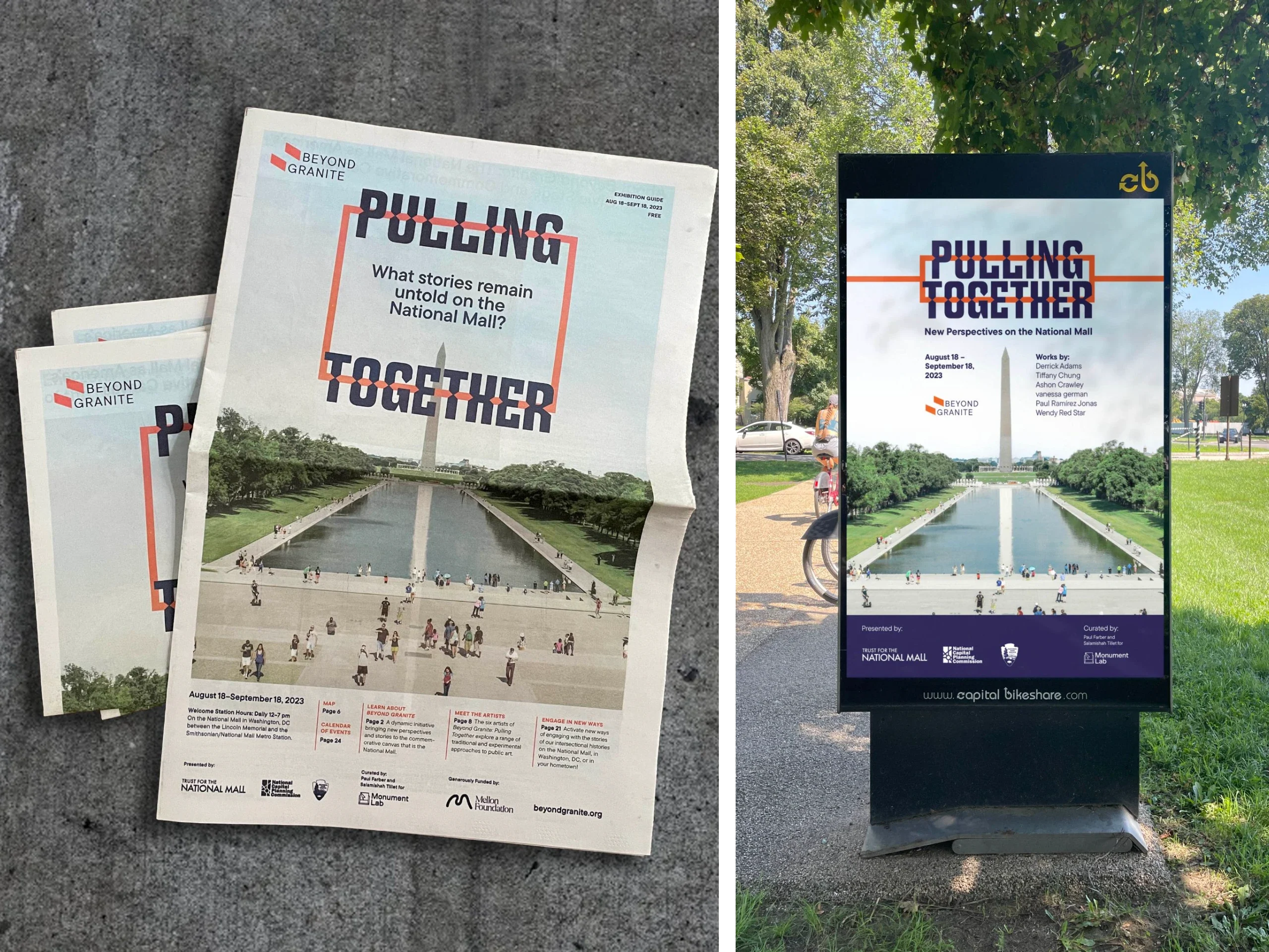
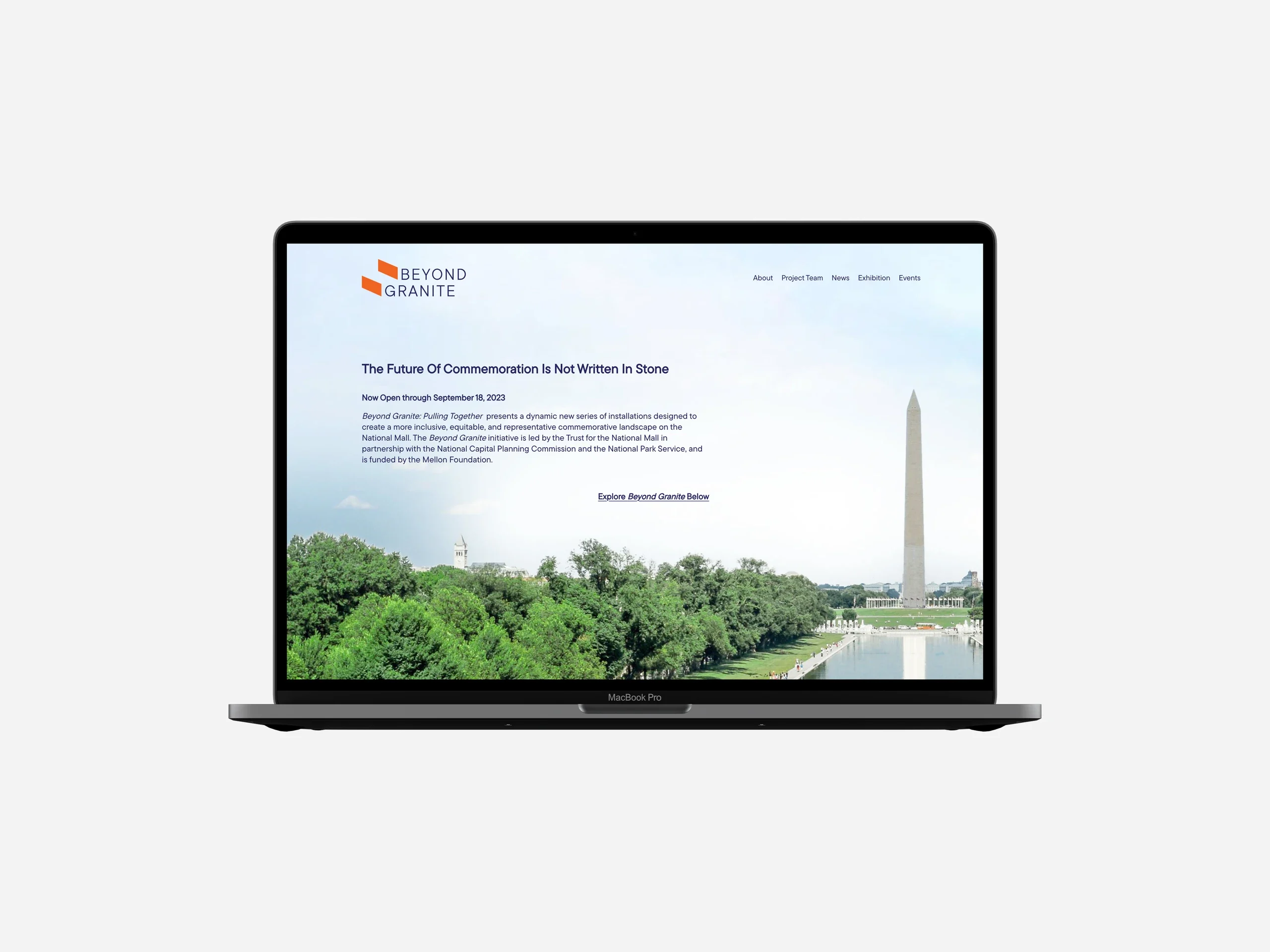
Beyond Granite needed two identities that would work together: One for Beyond Granite, and one for their pilot exhibition Beyond Granite: Pulling Together. They also needed design for wayfinding didactics, website, digital, video, and print assets for this exhibition.




CommboIdentity / Branding / Product Design2023
Credits
Creative Direction and Graphic Design:
Connie Harvey
Typeface:
Gotham Ultra by Hoefler&Co
Client
David Shteyman
Context
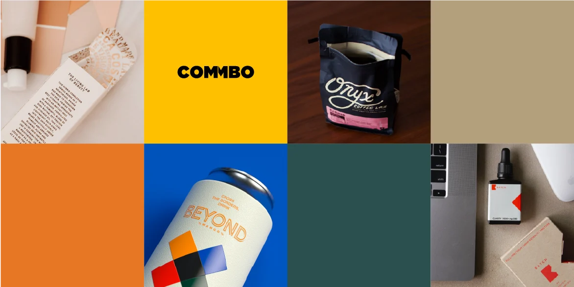
Commbo is a digital B2B marketplace for raw materials in consumer packaged goods (CPG), focusing on the most fragmented categories. Commbo’s mission is to revolutionize the $2 trillion raw materials market through a digital B2B marketplace that delivers unprecedented transparency, efficiency and cost savings.
Commbo is defined as a spark of brilliance as it fully functions as a standalone name as well as has a layer of a deeper meaning. It stands for Commercial Bond (Comm + Bo), thus reflecting our aspiration of establishing digital business relations between suppliers and buyers. In parallel, Combo means a combination of different things and conveys a broad range of various CPG ingredients and packaging wholesalers. Commbo has a triple effect of being brandable, recognizable in a blink of an eye, and meaningful for the purpose of our digital marketplace.
The Ask
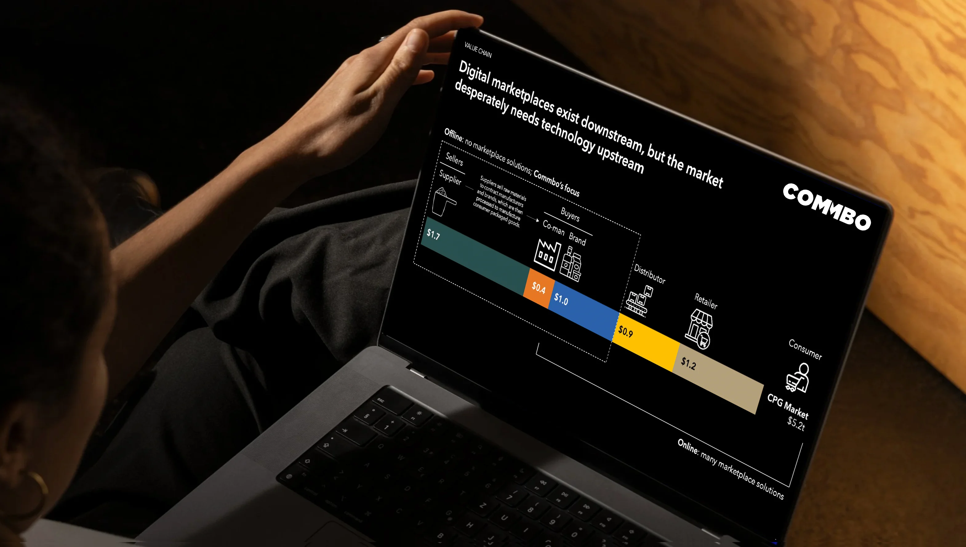
This project involved developing a new identity wordmark for the newly named start-up. I also worked closely with the client to create pitch deck screens for potential investors, along with a simple style guide and graphic assets for use when developing additional materials.
© 2026 Connie Harvey Design